Medical Device
UX/UI Design • Lead Prototype Development
2022

NDA-protected
Before my involvement, the company had already identified a meaningful gap in the market:
Traditional surgical tourniquet systems had not kept pace with the expectations of modern surgical environments
The opportunity was to move beyond hardware toward a more streamlined, cordless system with improved usability & intuitive operation.
The startup’s original direction was to develop a dedicated hardware controller for the Inflator Device.
This approach made sense because it felt familiar, tangible & closely aligned with traditional medical equipment.


However, the Hardware Controller presents several limitations:
High Manufacturing Costs
Development Complexity
Slow Iteration
Hard Updates & Limited Flexibility
Challenge
Redesign the original hardware controller concept into a regulation-aware tablet software controller by applying medical device UX research to design safer workflows, clearer commands & a functional interactive prototype.
Medical UX
Beyond a Modern Interface
This project required a different UX approach because it is part of a medical device system.
Typical app: UX decisions are often evaluated by convenience, speed, engagement & a frictionless experience.
Medical UX: It has to make the system safer to use, easier to learn, & more reliable in high-pressure surgical environments where clarity & confidence are critical.
Safety Friction
Remove unnecessary friction, but intentionally keep Safety Friction where the risk requires it.
A confirmation step, a visible status change, an alert, or a required review moment that can help prevent mistakes.
The goal is not to make the experience slower for no reason. The goal is to make critical actions more intentional & easier to verify.
Risk Management
Designing decisions to possible user errors.
A risk-based approach asks what could go wrong, how serious the result could be & how the design can reduce that possibility.
Accessibility & WCAG
The interface needed to be clear & usable across a wide range of visual & cognitive needs, with careful attention to contrast, readability, hierarchy, touch targets & clear, predictable interaction patterns.
These are important when users may be stressed, distracted, wearing gloves & working in a complex environments.
UX Direction
Shaped by
Existing hardware controller
Usability to complete tasks
Patterns to support safety
Hardware Controller
The original concept already contained important product thinking & stakeholder expectations for how the system should work.
Supported by research made previously:
analysis of opportunity in the market & product competitive comparison
The goal was not to remove the original vision. The goal is to identify which parts were essential for safe control, which parts could be improved through software & which opportunities could make the product easier to demonstrate, scale & evolve.
Usability
A medical device will be used in environments where attention is divided, pressure exists, gloves are worned, multiple devices & team members may be involved.
Because of that, critical information needs to be immediately visible & clear.
Features, visual & noise feedback have to be easy to recognize without forcing the users to interpret a complex interface.
This could be addressed through a UI design direction that embraces a modern, minimalist approach: larger typography, generous spacing, a clear visual hierarchy, reduced visual noise, recognizable icons & an overall familiar, intuitive experience.
Safety
UX decisions cannot be based only on preference or aesthetics in this project. Use risk-informed design decisions throughout the process.
Identify potential points of misuse or confusion early, test critical workflows with users, refine the interface based on observed behavior & document how each UX decision supports safer & effective use.
Learning from Hardware Version
The original hardware controller already established the product’s essential workflow:
Select & connect a device, set pressure & time, monitor device status & adjust operation when needed.
I reviewed the controller to identify
Usability & Features users are familiar
Where the existing layout could create uncertainty

Core Features
Pressure & Time
Presented as the primary controls (Arrow shaped buttons positioned alongside each value)
Large numerical values
Most important settings easy to scan at a glance.
UI Features
Device selection
Bluetooth pairing & connection status available.
Battery (both controller & connected device)
Visual information when adjusting

Opportunities
Controls & status information are distributed across multiple areas.
Visual hierarchy competes across the interface.
Repeated feature information
Increases visual density without necessarily increasing understanding.
Reduce readability
Small labels, compact icons & dense grouping
Unclear Activity
It is not always clear which action is expected after a device connects, when Auto mode is active, or when an adjustment process is complete
Accessibility & Usability Framework
Users may be working under time pressure, multitasking, wearing gloves & operating in environments where visibility, attention & predictability can change quickly.
In these situations, usability & accessibility become critical contributors to safe & effective use.
To support these real-world conditions, this project was shaped by WCAG 2.1 AA principles & medical UX practices.
With a focus on:
Reducing cognitive load
Improving task efficiency
Maintaining clear system awareness
Reducing opportunities for use-related error
Clarity
The interface needed to make critical information immediately recognizable, especially pressure, time, device status & system feedback.
The design should prioritize:
clear hierarchy between primary & secondary information
large, legible treatment values
consistent placement of controls & status information
labels paired with icons to support recognition
reduced visual noise around critical actions
Task Completion
The interface needed to support a known sequence based on the Hardware Controller version:
The design should prioritize:
obvious step-by-step task progression
visible & relevant "active feature mode"
fewer decisions shown at the same moment
clear feedback after each action
user-test frequently
Use-error Reduction
The interface needed to reduce accidental activation and misinterpretation.
The design should prioritize:
separate high-impact actions from routine actions
making system status visible before the possibility of user acts
using confirmation or safety friction for higher-risk actions
keeping warning/active states visually distinct
supporting recovery when something needs attention
WCAG Design Decision
Accessibility principles should translate into visual & interaction decisions:
high contrast for text, controls & states
color not used as the only source of meaning
clear pressed, active, warning, disabled & completed states
readable typography & spacing
large touch targets
predictable navigation & feedback
This framework guided the design development by making important actions easier to:
Find
Understand
Complete
Helping users to:
Stay oriented
Make confident decisions
Avoid preventable use errors
UI Design
Color Concept
Through conversations with doctors,
I’ve learned that a consistent color system can reduce cognitive effort, improve side recognition & provide immediate visual confirmation during an operation.
It plays a critical role in helping clinicians/doctor/users quickly identify key information, orient themselves & act with confidence.
Red = Right Side
Blue = Left Side
Red & Blue are commonly used in dual-channel surgical Tourniquet Systems, but their use is not universal.
For this project, this logic was defined as a required orientation system by stakeholders.
UX/UI Design
Features Prioritization
I prioritize the ideas identified through the hardware version, doctor feedback, stakeholder expectations & future product discussion
This helps define what the control tablet needs to support in the functional prototype, what can improve the experience, & what remains as a future opportunity.
Core Features
Pressure + Time Control
Inflate / Deflate
Connection Status
Warnings & Questions
Desirable Features
QR Code Scanning
Auto Function
Future Features
Software Version for Mobile
UX/UI Design
First sketches
Visually rough, they helped me to explore possibilities & important questions like:
How to organize pressure & time
Handle one or two devices
Make the screen readable, responsive & safer to us
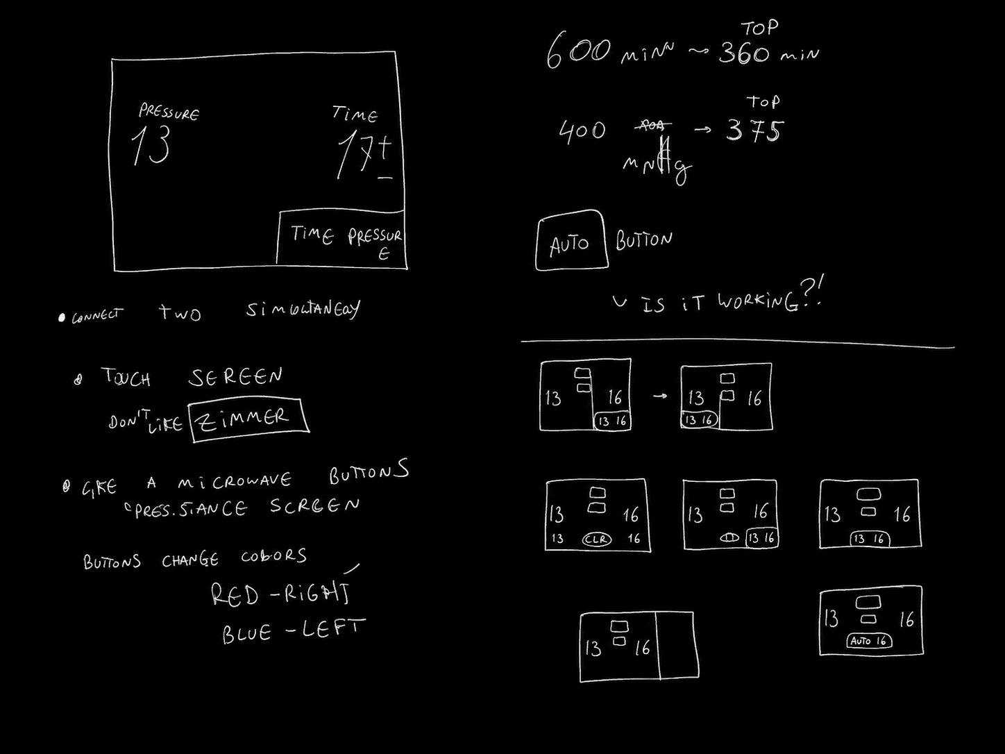

Organizing Pressure & Time
One of the first priorities is deciding how to position the most important information.
Pressure & Time are the primary control values, so they need to remain visually dominant throughout the interface.
Dual-Device Possibilities
The sketches also explore how the interface can support two inflator devices.
This includes early thinking about simultaneous control, screen division, & ways to distinguish one device from the other without making the main single-device workflow harder to understand.
Large Information & White Space
From the beginning, I focus on readability & spacing. Critical information needs to be large enough to recognize quickly & separated enough to reduce visual busyness.
Large typography, generous spacing, & clear grouping reduce interpretation effort & support faster recognition, especially in environments where attention may already be divided.
Safety-Related Thinking
The sketching stage also introduces early questions about safer pressure & time behavior.
I consider how high pressure settings should go, how long time settings should be supported, & how the interface can help users remain aware of potentially prolonged use.
UX/UI Design
After prioritize the ideas identified through the Hardware Controller, doctors feedback, stakeholder expectations & future product discussion, I am defining how each feature should behave within the Software Controller.
This early overview helps clarify what each feature needs to display, what user feedback it requires, what can go wrong, & what needs to be validated before the product moves beyond the prototype stage.
For every core feature, I ask:
What is happening right now?
What can the user do next?
What happens after the user taps?
How is the action confirmed?
What happens when something goes wrong?
What must be tested before the feature can be trusted?
Device Identification / Connection
Users first need to know which Inflator Device they are connecting to & whether the connection is safe to use.
State
The interface should show the current connection state: scanning, device found, connecting, connected, failed, incomplete, or unavailable. Before any control command becomes available, the user should confirm that the device ID shown on the tablet matches the physical Inflator Device.
Action + Feedback
Users can scan a QR code or enter the device ID manually. After the user takes action, the system searches for the matching Inflator Device & attempts connection. The action is confirmed through visible device identity, connection status, battery status, & active/inactive device state.
Failure + Validation
If connection fails, the interface should explain that the device is not ready & guide the user to retry, rescan, or manually confirm the device. If the Inflator Device battery is below a defined safe-use threshold, the system should prevent connection or active use to reduce the risk of the device stopping during surgery. This feature must be tested to confirm that users can identify the correct device, understand connection status, recognize battery-related blocks, & recover from failed or incomplete connection states without confusion.
Pressure Control
Users need to understand the current pressure value, what pressure they can select next & whether a pressure change is actively happening.
State
The interface should make the current mmHg value highly visible & clearly show whether the pressure is idle, selected, changing, applied, or not confirmed. The user should always understand the current pressure state before making an adjustment.
Action + Feedback
Users can increase & decrease pressure values. The interaction should feel deliberate, not accidental. After the user selects the pressure control, the interface is updated through visible value change.
Failure + Validation
If the command fails, the interface should clearly communicate that the pressure was not applied & avoid suggesting that the device changed state when it did not. This feature must be tested to confirm that users can read pressure quickly, adjust it accurately, avoid accidental changes & understand whether the selected value has actually been applied.
Inflate / Deflate
Inflate & Deflate are primary actions, so users need to clearly understand whether the device is idle, inflating, deflating or already active.
State
The interface should clearly show the current device state before any action is taken: ready, idle, inflating, inflated, deflating, disconnected or unavailable. These states need to be immediately understandable because they affect the user’s next decision.
Action + Feedback
Users should be able to start inflation or deflation only when the device is connected, identified & ready. After the user taps Inflate or Deflate, the system should send the command & immediately communicate that the action was requested. Confirmation should include a visible active state, command feedback & device response showing that inflation or deflation is actually happening.
Failure + Validation
If the command fails, the interface should show that the action was not completed & avoid leaving the user unsure about the device status. This feature must be tested to confirm that users understand the difference between tapping a command, the command being received & the device actively responding.
Time Control
Users need to know how much time is selected, how much time remains & whether time-related events require attention.
State
The interface should make the selected time, remaining time & session status easy to understand at a glance. Users should know whether the timer is inactive, active, approaching a warning moment, completed or requiring a decision.
Action + Feedback
Users should be able to adjust time, extend a session or respond to time warnings without losing awareness of the current device state. After the user taps a time control, the interface should update the selected time or remaining duration clearly. Confirmation should come through visible timer changes, active countdown behavior & alerts when time approaches a critical moment.
Failure + Validation
If something goes wrong, such as the timer not starting, reaching zero, missing a warning or requiring user decision, the interface should clearly communicate what happened & what action is available next. This feature must be tested to confirm that users can set, monitor, extend & respond to time safely, especially during alerts or last-minute warnings.
Auto Mode
The interface should clearly show whether Auto Mode is inactive, active, calculating, adjusting, inflating, deflating, waiting for input, or unable to continue. Because Auto Mode introduces automated pressure behavior through an LOP-based algorithm, the system should make automation visible instead of relying on hidden logic.
State
Users should be able to activate Auto Mode, monitor what it is doing & interrupt or override it when necessary. After the user taps Auto Mode, the interface should show that automation has started & communicate the current automatic behavior through status labels, active states & feedback tied to the device response.
Action + Feedback
Users should be able to start inflation or deflation only when the device is connected, identified & ready. After the user taps Inflate or Deflate, the system should send the command & immediately communicate that the action was requested. Confirmation should include a visible active state, command feedback & device response showing that inflation or deflation is actually happening.
Failure + Validation
If Auto Mode cannot continue, receives unreliable information or requires manual decision-making, the interface should interrupt clearly & return control to the user. This feature must be tested to confirm that users understand what Auto Mode is doing, when it is active, what information it depends on & how to safely regain manual control.
Battery Status
Users need to clearly distinguish between the tablet battery and the Inflator Device battery, with primary focus on the Inflator Device as it directly impacts safe operation.
State
The interface should show both battery statuses in a clear and non-confusing way. Users should be able to immediately recognize whether the tablet battery is low or whether the Inflator Device battery is low, with stronger emphasis on the Inflator Device since it affects device functionality during use.
Action + Feedback
Users should be able to quickly check battery levels without interrupting their workflow. When viewing battery status, the interface should present clear labels & visual indicators that differentiate the tablet battery from the Inflator Device battery. Any change in battery condition should be communicated through visible updates & status feedback.
Failure + Validation
If battery levels become unsafe, the interface should clearly communicate the issue & guide the user toward the next safe action. If the Inflator Device battery is below a defined safe-use threshold, the system should prevent connection or active use before a session begins. This feature must be tested to confirm that users can easily distinguish between tablet & Inflator Device battery, understand which one is critical & respond appropriately to low battery conditions.
Errors, Confirmation + Safety Friction
Users need to recognize when something requires attention, understand the risk & choose the correct next action without command uncertainty.
State
The interface should separate normal feedback from critical warnings. Users should understand whether the system is operating normally, waiting for confirmation, warning about a recoverable issue or interrupting the workflow because of a high-risk condition.
Action + Feedback
Not every action needs extra confirmation, but actions that could create risk, interrupt workflow, affect device state or require final decision-making should use intentional safety friction. After the user taps an action connected to risk, the interface should confirm the command, show what changed & make the next available action clear.
Failure + Validation
If something goes wrong, the interface should explain the problem in plain language, show the current system state & guide the user toward recovery. Examples include failed connection, wrong device ID, low battery, missed alarm, active device disconnection, shutdown decisions, time extension, or reviewing device status. Active disconnection should trigger an unavoidable alarm state, show the last confirmed device status, stop implying live tablet control & guide the user toward a validated recovery path. This feature must be tested to confirm that users notice critical messages, understand what is happening, select the correct action, & recover safely without relying on guesswork.
UX/UI Design
The cordless experience differentiates this system in a market where inflators are typically overwhelmed by cables.
Bluetooth connection makes this possible.
Connection as a Trust Layer
Before users can control pressure, time, or inflation, the system first needs to confirm that the correct Inflator Device is identified, connected & safe to use.
In this project, the connection flow is not just a technical setup step. It becomes a trust layer between the tablet interface & the physical device. If the user connects to the wrong device, loses connection or cannot understand the current device status, every control action after that becomes uncertain.
The connection flow needs to answer these three questions before unlocking the main controls:
Which Inflator Device am I connected to?
Is this the correct device?
Is the device ready & safe to control?
The Familiar Bluetooth List

In a typical consumer product, Bluetooth pairing can stay in the background. A user selects a device, waits a moment & moves on.
This familiar pattern is useful because it is recognizable, but it is not enough for a medical control workflow. A standard Bluetooth list can show nearby devices, but it does not fully answer whether the selected device is the correct Inflator Device, whether it is ready to use, or whether it is safe to control.
Design
For the Software Controller, connection needed to become more than device discovery. The interface have to support identity confirmation, connection status, battery readiness & device state before allowing any control command.
This means the connection flow could not rely only on a list of available devices. It needs to clearly communicate the difference between a device being found, selected, connected, confirmed & ready for control.
Validation
The design needed to be tested to confirm that users do not confuse the connection status & they have to understand why controls remain unavailable until the Inflator Device is ready.
Device Identification
Before the user can control pressure, time, inflate, or deflate, they need to know exactly which Inflator Device the tablet is communicating with.
In a clinical environment, multiple devices may be nearby & a generic Bluetooth name is not enough to support safe selection. If the wrong device is selected, every action after connection becomes totally unreliable.
Design
The connection flow starts with device identification before control. Users can scan a QR code or manually enter the device ID. The system then searches for the matching Inflator Device & displays the device identity before unlocking the main controls.
The interface should make the selected device visible through clear ID labeling, connection status, battery status, & active/inactive state. The user should be able to compare the ID shown on the tablet with the physical Inflator Device before trusting the connection.
Validation
The design needed to be tested to confirm that users can identify the correct Inflator Device, understand which device is being connected, & recognize when the selected device does not match or cannot be confirmed.
Making Connection Status Visible
To support a clear visual hierarchy, I designed a dedicated Bluetooth status component for the Software Controller.
The purpose is to keep device identity, connection state, side assignment & battery status visible in the same location across the flow.
Before users can control pressure, time, inflate or deflate, they need to understand which Inflator Device is connected, whether it is assigned to the correct side & whether it is ready for control.
Component structure:
The status bar combines five pieces of information in one compact area:
Bluetooth icon
Bluetooth Status (written)
Device Name/ ID /Serial Number
Side Selection (written)
Inflator Device battery status
Visual approach
The idea is that the component remains in the same location across screens, facilitating the identification by the users.
Its size must give enough room for readable status text, device identity, side assignment & battery status without competing with the main pressure & time controls.
The interface must communicates the full Bluetooth connection status:
Not Connected → Connecting → Connected → Disconnecting
UI Approach
Inspired by the modern mobile & tablet interfaces, where the continuous rounded shape distinguish from rigid containers. Constrasting with traditional interfaces foound on medical & industrial industriies, that rely on square, heavy button structures that feel dense & rigid.
The rounded shape came from the idea of continuity & connection. Reference circular forms, which are commonly associated with linking, pairing & ongoing system states. This makes the component feel like an active, living part of the system rather than a static label.
This shape also creates a secondary layer of hierarchy, allowing users to quickly identify it.
Spacing & layout are carefully considered to support readability.
Clear spacing between elements prevents visual clutter & supports quick scanning.
Typography plays a key role in this structure. The font size is large enough to be readable at a glance, even in clinical environments where users may be standing or moving.
Overall, the rounded structure reflects a shift toward a more modern, human-centered interface approach.
It balances clarity, hierarchy & touch usability while introducing a softer visual language into an industry traditionally dominated by rigid, box-based layouts.


Not Connected
The tablet is not currently communicating with an Inflator Device.
To avoid uncertainty, the status should be displayed in written form as NOT CONNECTED. Instead of "disconnected" that can imply that the tablet was previously connected & then lost the connection.
Use a solid white color for this status.

Connecting
Once the user begins the connection process, the component changes immediately.
This state is important because it prevents the system from appearing unresponsive. It acknowledges the user’s action while making it clear that the connection is still in progress.
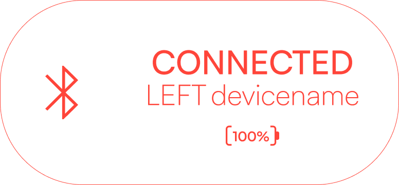
Connected
The connected state provides the most important confirmation moment in the flow, the tablet is connected to a confirmed Inflator Device.
This creates a compact verification checkpoint before physical controls become available. The user can confirm that the Controller communicates with the intended device, that the device is assigned to the correct side & that the battery level is visible before beginning treatment.
Disconnecting
When the user chooses to disconnect, the component changes to Disconnecting before returning to the not-connected state. This makes the transition visible while the Controller ends communication with the Inflator Device.
The user receives feedback that the action is in progress rather than wondering whether the device failed, disappeared or disconnected unexpectedly.
Because disconnecting can affect control, the Bluetooth status component should not disconnect immediately when tapped. It should open a confirmation step.

Bluetooth Connection flow

Accessibility Considerations
Connection status is communicated in different ways:
Written language
Iconography
Layout position
Visual state
The experience does not rely on color alone to communicate whether a device is connected, disconnected or assigned to a specific side.
Color reinforce side assignment, but the written side label confirms it.
Battery level appears as a numerical percentage, not only as a visual indicator. This gives users a more precise understanding of device readiness. Also, because this format is already used in different devices.
The component also has readable type size, clear contrast, clear tap targets & every step of status changes.
Medical UX Impact
Bluetooth pairing as a visible safety checkpoint.
Instead of hiding the connection process in the background, the Software Controller brings it forward and makes it a safety step.
This establishes a connection experience that helps the user move from uncertainty to confirmation before any physical command is sent to the Inflator Device.
Beyond that, in the component supports several medical UX principles:
Visible system status: The Controller communicates what the system is doing at every stage.
Use-error reduction: Device identity & side assignment remain visible before control begins.
Recognition over recall: Users do not need to remember which device they selected earlier.
Intentional transitions: Connecting & disconnecting appear as clear states rather than invisible events.
This section explores safety through possible undesired friction that may appear in the user flow & how the experience can respond to it.
Identifying the Correct Device
Desired by stakeholders & confirmed by research, the primary connection method uses QR-code scanning.
The user scans the QR code located on the Inflator Device, allowing the Controller to recognize a specific physical device instead of presenting a broad list of possible Bluetooth connections. This turns pairing into an identification moment: the user holds the device, scans its label, then sees that same device appear on screen.
When the Primary Path Fails
A camera may struggle in low light. A device label may be damaged, obscured or difficult to scan at the moment. The user may also be working in a context where repositioning the device for a scan creates unnecessary friction.
The screen presents a manual option. The user can enter the device ID shown on the physical label, then continue through the same verification process.
So, whether the ID arrives through a scan or manual entry, the Controller still confirms one specific Inflator Device.
Dual-Device Connectivity
After identifying the correct device, either by scanning its QR code or entering its ID manually, the user assigns a color to the first connected Inflator Device for a clear identification.
When a second device is added, it is automatically assigned the opposite color, creating a clear visual distinction between the two.
The connection flow includes an explicit color-assignment step. Rather than relying solely on device IDs, the interface uses color as an additional visual cue, making each connected device easier to recognize throughout the Controller experience.
This creates a more complete confirmation loop:
Correct device → Correct color assignment → Ready to control
UI Design
Complete Connection Flow

UI Design
Pressure control
Pressure control is one of the primary functions in the Controller Tablet because it directly affects the Inflator Device + Cuff behavior.
Pressure Control feature needs to remain unmistakable at all times. Should never be mistaken by the Time Control feature, so they need to be far apart & clearly labeled.
Composition
When analysing other Tourniquet Systems, a common pattern for the Pressure Control feature is:
Positioned on the left side of the screen
Numeric value
mmHg unit
Plus/minus buttons
This familiar structure helps users recognise the control quickly & reduces the learning curve for every user.
UI + Behaviour
The pressure adjustment needs to feel easy to operate, clear to identify & difficult to use incorrectly.
The plus & minus controls need visible interaction states that confirm every touch.
Unlike a physical control, the touchscreen does not provide mechanical resistance, travel distance or tactile feedback.
Sound or vibration cannot be considered as form of feedback for this project. In this environment, they will probably be inappropriate, inconsistent, or undesirable.
Instead, I focused on a visual feedback. Pressed button variants, contrast changes, color & brightness shifts are ways to make the visual feedback be relevant.
Also, a slightly slower visual change can make it clearer that an action worked than a quick transition that is easy to miss.
mmHg
275

UI Design
Time Control
Time Control is one of the primary variables in the Tourniquet System. Alongside Pressure Control, it directly affects the behavior of the Inflator Device & Cuff.
Composition
Similar to Pressure Control, the Time Control feature follows a familiar interface pattern:
Positioned on the right side of the screen
Numeric value
Min unit
Plus/minus buttons
UI + Behaviour
Beyond the simple UI structure, Time Control requires additional attention because it is not only a setting. It is also a safety-critical feedback layer.
Clinicians may be focused on the procedure, communicating with other staff, or managing multiple tasks at the same time.
For this reason, time needs to act as active feedback through visual & audible signals rather than remaining a passive number on the screen.
min
60
Time Safety Behaviour
Hourly Signal
The hourly signal supports ongoing awareness without requiring users to constantly monitor the screen.
Every hour, the system provides a visual notification & audible cue. This signal acts as a reminder rather than an emergency alarm. Its purpose is to keep time visible within the clinical workflow without interrupting the procedure unnecessarily.
Five-Minute Warning Phase
The final five minutes become a dedicated warning phase.
At this stage, the system enters a stronger alert state, giving clinicians enough time to decide whether to extend the session, prepare for deflation, or document the timing status.
This warning phase creates a clear decision point before the system reaches zero. It supports safer action by reducing the chance that the timer expires unnoticed.
Final-Minute Feedback
As the countdown approaches its end, the interface communicates increasing urgency.
Visual flashing is explored as a way to make the remaining time more noticeable. However, from an accessibility perspective, flashing needs to be intentional, limited, & paired with other cues. It should not become the only signal of urgency.
The final-minute feedback should combine clear text, audible alerts, visual emphasis, & predictable timing. This helps users recognize that the session is approaching a critical decision point, even when their attention is divided
The goal is not to create stress. The goal is to make the time status impossible to miss.
Zero-Time Automatic Deflation
When the countdown reaches zero, the tourniquet deflates immediately & automatically. No prompt, confirmation, or additional user decision is required.
This behavior prioritizes safety by preventing inflation from continuing beyond the defined time limit.
To help clinicians prepare before automatic deflation, the system provides escalating alerts during the final five minutes of inflation. Audible & visual notifications occur at 5 minutes remaining, then at 4, 3, 2, & 1 minute remaining.
During the final 30 seconds, alerts occur at 30 seconds, 20 seconds, then every second from 10 down to 1.
This alert sequence creates a predictable rhythm that keeps users aware of the remaining inflation time while still guaranteeing immediate deflation when the timer expires.
Impact
The Time Control logic supports Medical UX principles by improving visibility of system status, reducing missed information, supporting error prevention & creating clearer decision points.
The interface does not treat time as a passive number. Instead, time becomes a safety-supporting layer connected to alerts, clinical decisions, device behavior & procedure records.
UI Design
Auto Mode
Auto Mode is one of the most important interaction challenges in the Tourniquet System because it introduces automated pressure behavior through an LOP-based algorithm. Instead of relying only on manual pressure adjustments, Auto Mode allows the system to help define & adjust pressure based on automated logic.
The user needs to clearly understand when Auto Mode is:
Active/Deactivate State
What the system is doing
If pressure is being increased or decreased
If the Inflator Device is inflating or deflating
The UX challenge is:
How can Auto Mode communicate clearly enough to prevent confusion, support better decision-making & keep the experience safe & trusted?
Visible
If the user presses the Auto Mode button & nothing changes visually, the interface feels uncertain.
The button remains visually highlighted while automation is enabled, helping the user recognize that the system is operating under automated pressure control.
This supports users with color vision differences, reduces ambiguity & improves recognition in high-pressure clinical environments.
Activity Feedback
Auto Mode may require the system to inflate or deflate depending on the current pressure state, target pressure & system commands.
Because of this, the interface needs to communicate the direction of the automated action.
The pulsing feedback pattern is already used for manual Inflate & Deflate interactions.
Reusing the exact same feedback for Auto Mode creates a risk of users may not be able to tell whether the action is manual or automated.
Auto Mode should have its own visual UI style when activated & then influence the same visual language to show wether the system is inflating or deflating.
Prototype Version
The goal is not to design a complete final automation system. The goal is to demonstrate the core logic: the control tablet can activate an automated state, show that the device is working, communicate the direction of pressure adjustment, & make automation visible to the user.
This is important because more advanced automation requires additional clinical validation, engineering logic, risk analysis, alarm behavior definition, & regulatory documentation.
For this prototype, the main objective is to make automation understandable. Auto Mode should feel active, observable, & supervised rather than hidden, silent or unpredictable.
Impact
Auto Mode supports Medical UX principles by improving visibility of system status, reducing manual workload, supporting clearer decision-making & making automated device behavior easier to understand.
The interface shows when automation is enabled & what action the system is taking.
This creates a safer & more trustworthy automation experience, where the users always remains informed.
UI Design
Dual-device control
Dual-device control is an important requirement for the Tourniquet System because many clinical workflows may require more than one inflator device.
While controlling one inflator is more straightforward, the system also needs to support a second device.
The UX challenge is:
Adding A Second Device
Adding another inflator device cannot be hidden, accidental, or too close to the primary controls. It needs to be available, but clearly secondary.
When the user selects the dedicated Add Device button, the tablet launches a device-pairing flow exactly as the initial setup experience. This creates a familiar interaction pattern, reduces the need to learn a new workflow & makes it clear that the user is intentionally expanding from one connected device to two.
Also, supports error prevention by making sure the second device is intentionally connected, assigned & visually recognized before it becomes controllable & changes the interface.
Device Differentiation
The dual-device flow uses the Red = Right & Blue = Left orientation logic explored earlier in the project.
When the first device is assigned to one side, the second device follows the opposite color orientation. This creates a clearer relationship between both inflators & reduces the chance of two devices appearing visually identical.
View Structure
A single-device screen can dedicate most of its space to one set of controls, status information & feedback.
Introducing a second inflator changes the screen hierarchy because the same tablet now needs to support two device states without reducing readability or increasing the risk of user error.
This leads to two possible view structures:
Individual control view & simultaneous control view.
Individual Control View
In an individual control view, the user would focuses on one inflator device at a time & switches between devices when needed.
This approach keeps the interface simpler, reduces visual complexity & makes it easier to understand which device is currently active. It is especially useful when each side requires different pressure settings, timing, or commands.
However, this approach also requires strong switching feedback. The interface needs to make the selected device obvious at all times through side label, color orientation, device identity & active-state emphasis.

Simultaneous Control View
In a simultaneous control view, both devices are visible on the screen at the same time.
This allows users to monitor & compare both inflators in parallel. It can be useful when both sides need to remain visible during the procedure, especially when pressure, time or alert states differ between devices.
However, this structure introduces more cognitive load because the user needs to interpret two sets of information at once. To make this approach safe, the interface needs stronger visual separation, clear side identification, consistent layout, & immediate command feedback.
Medical Environment Considerations
The users work quickly, dividing attention across multiple tasks, communicating with other staff & monitoring the patient at the same time. In this context, the interface cannot assume that users will stop & carefully verify every action.
The design needs to support quick recognition. Users should be able to recognize the correct device quickly through position, label, color orientation, device status & feedback.
Impact
Dual-device control supports Medical UX principles by improving device recognition, reducing wrong-side interaction risk, supporting situational awareness & keeping advanced functionality accessible without overwhelming the default workflow.
The interface does not treat the second inflator as just another duplicated control panel. It treats dual-device control as a safety-critical expansion of the system.
By combining guided pairing, side assignment, redundant identity cues, clear view structures & strong command feedback, the tablet can support two connected devices while preserving clarity, confidence & control.
UI Design
UI Definition
The previous feature analysis had a strong impact on the visual direction of the system. Each core feature introduces a UI requirement that cannot be ignored.
Pressure Control requires strong numeric hierarchy
Time Control requires continuous visibility & alert support
Auto Mode requires clear active states & system transparency
Dual-Device Control requires strong side recognition, device identity & command confidence
The UX challenge is:
How can the interface feel reliable & safety-focused like a medical device, while becoming clearer, more spacious & easier to use as a modern UI?
Current Market
Before start exploring ideas, I analyzed current tourniquet systems & similar medical systems already available in the market to learn about their UX/UI.
These products have characteristics in common, like:
Pressure & Time are highly visible
Device/Channel separation are clear
Inflate/Deflate buttons must be easy to identify
The market review showed that the core function of these products is already well established.
The main opportunity was not to reinvent the medical function, but to improve how users read information, recognize what matters & take the action desired.


UX Analysis
Functional, but unclear.
These products present the necessary information, but the interface can feel overcrowded.
According to users reviews:
Visually busy
Icon-heavy
Unclear about what is active & what is only information
Unclear about what action should happen next
Many current products have:
Dark background
High-contrast numbers
Red/Blue logic colors
Icons
Outdated visual & physical style buttons.
The interface can feel outdated, crowded & fragmented, making it harder to identify active controls & only informational.

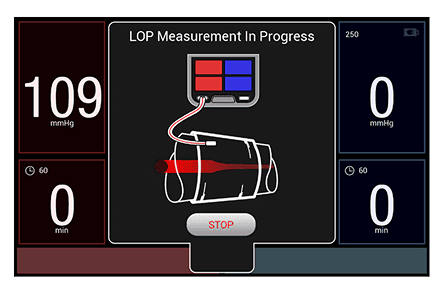
Based on market analysis, user reviews, stakeholder input & potential user feedback, I identify:
Preserved:
Clear numeric hierarchy
Clear pressure & time visibility
Channel separation
Color-coded identification
Always-visible device status
Direct access to key commands
Opportunity:
Reduce visual noise
Increase spacing
Avoid relying only on icons
More obvious active/inactive states
Make main actions easier to find & press
Create a more modern, cohesive visual identity
Visual Inspiration
I explored modern automotive & hardware control interfaces to understand how complex systems can feel clear, direct & controlled.
Dark, focused interface
Large numeric hierarchy
Clear system status
Modular control areas
Minimal visual noise
Precise technical feeling
Strong connection between screen & machine
Modern hardware-software identity


Clarity & Safety > Style
While these references offered a strong visual direction, they had to be adapted for a medical device.
Larger touch targets
Clearer labels
Stronger contrast
Colour supported by text
Fewer hidden controls
Visible system states
Direct feedback for critical actions

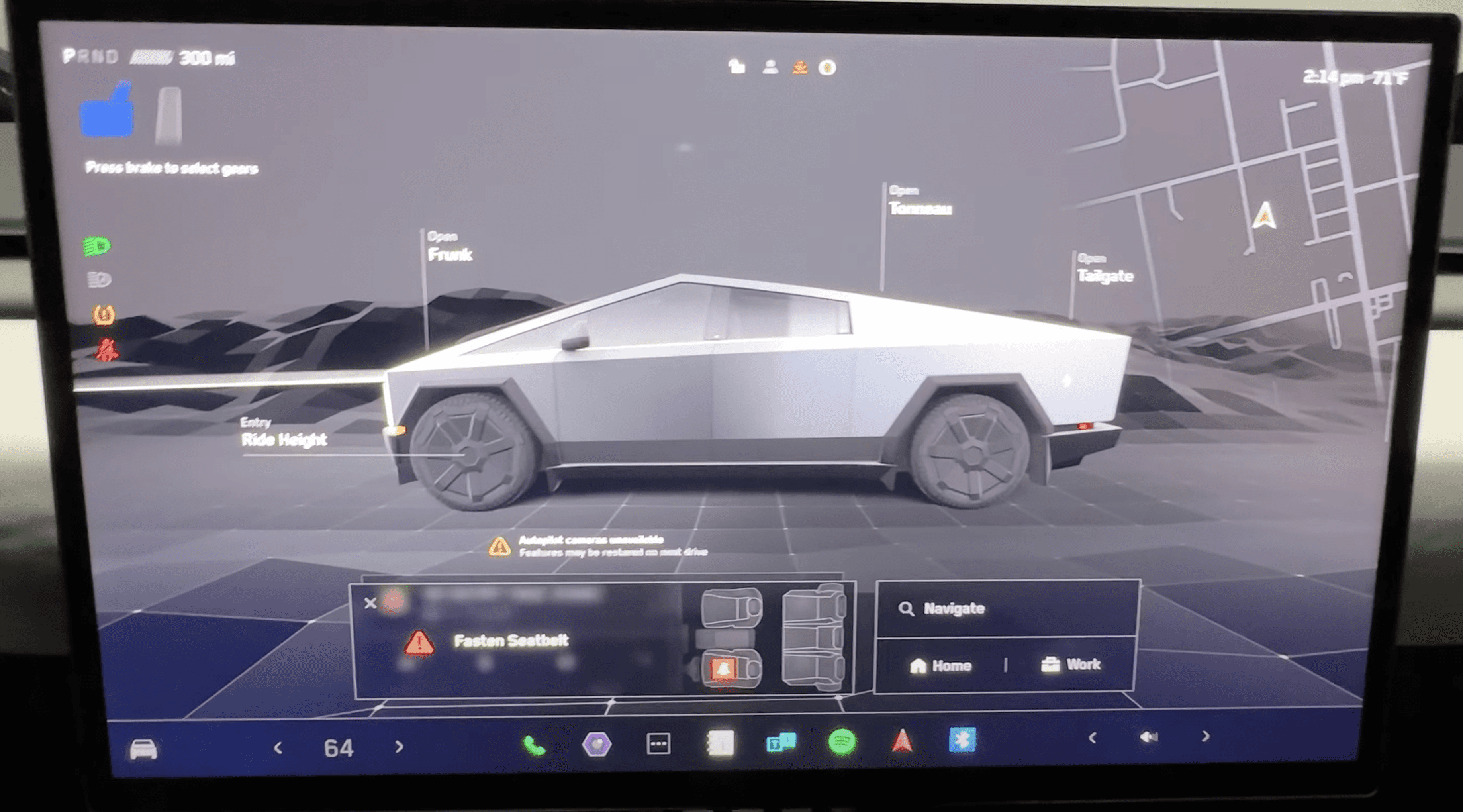
The Vision
The interface needed to feel modern, precise & visually unique, but still familiar for a medical environment.
Not something visually loud or overly futuristic.
The goal is to create a solid, beautiful & easy to trust UI.
Creating a visual identity that feels:
Professional
Calm
Technical
Confident
Minimal
Safety-oriented
Device-connected
Color System
The color direction was partly predefined by the stakeholders & confirmed by common patterns found in current medical device interfaces.
The main palette combines a dark background with bright functional accents & neutral supporting colors.
The dark interface creates a focused environment, while the accent colors help critical values, active states & alerts stand out clearly.
Since the system involves dual-device control, Red/Blue were used as functional identifiers to support side & channel recognition.
Accessibility also shaped the color system.
Strong contrast between text, values, controls & background helps improve readability & supports a WCAG-aligned interface, while still maintaining a modern, technical visual identity.

Typography
This UI needs to be eligible quickly, sometimes at a distance & in a high tension environments where attention is divided.
For that reason, the typography needed to support clarity, strong hierarchy & clean numeric forms.
Satoshi
Satoshi was selected because it brings a modern, clean & geometric aesthetic.
Working well with large numbers, clean labels & empty space.
Its simplicity helps the interface feel contemporary, while still allowing the content to remain the focus.



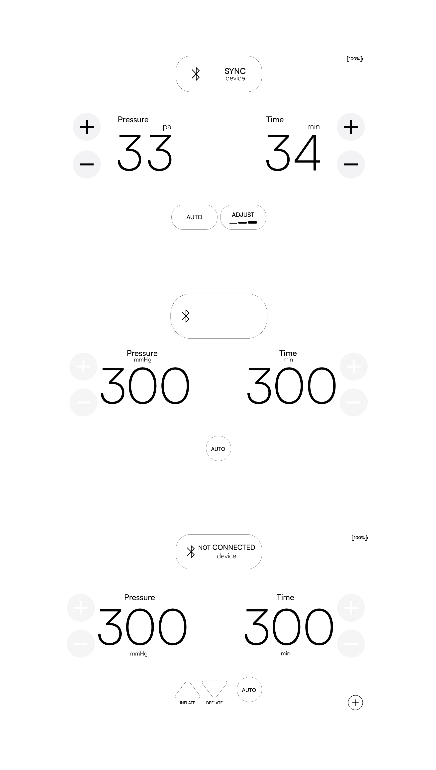
Layout
I gathered my early sketches & started explored low-fidelity screen variations to find the right position, spacing & proportion between the main elements.
These explorations helped answer important layout questions:
Where should connection status live?
Should pressure and time be side-by-side?
How large should the numbers be?
Where should inflate and deflate sit?
How should Total Tourniquet Time stay visible without becoming distracting?
How can the layout support both single and dual-device control?
The early wireframes helped refine the interface from a visual idea into a functional screen system.
The goal was to find a layout that felt balanced, readable, & operationally safe.
The final direction used clear zones:
Top area for connection & device identity
Main area for Pressure & Time
Side controls for adjustment
Bottom area for actions & auto mode
Mirrored structure for dual-device control
This structure helped make the interface predictable & easier to scan

Feedback, Error & Questions
The UI also needed a clear strategy for error messages & questions.
They must be visually stronger than regular interface elements, interrupting the visual calm of the dark UI without creating confusion.
Using stronger contrast, clear text, icon support & visible state changes.
Feedback behaviour should not rely only on blinking or color. It should combine motion, text, sound & visual emphasis when necessary.
The system should reduce uncertainty before, during & after each command.



After defining the visual system, typography, layout, colors & feedback behavior, the next step was to define the icon language.
Icons could not be treated as decoration. In this product, icons support recognition, action clarity & faster scanning.
They needed to match the visual identity while still being understandable in a medical-control context.
The UI definition created the foundation. The icon language would then refine how actions such as connection, inflate, deflate, auto mode, battery, alerts, and device status are visually represented across the interface.
UI Design
Icons
The icon language was created to make commands, states, primary & secondary actions easier to recognize across the control tablet.
The icon language needs to be approached carefully.
Critical functions should not rely only on icons. Instead, icons needed to work together with labels, placement, component structure & feedback states.

Inflate / Deflate
Simple triangular forms to show direction: up for Inflate & down for Deflate. This makes the action easy to understand quickly.
Primary feature, the text labels make sure the action is not understood by shape alone.
AUTO Mode
Circular shape helps distinguish it clearly from the other command buttons.
Explored in different states: outline, filled & animated colored. The outline version works as a neutral or inactive state, while the filled version is active.
Keeping the word “AUTO” inside the button makes the function clearer & reduces ambiguity.
*Red & Blue accent can help connect AUTO mode to the dual-channel system.
Dual Device Modes
Explore two ways of showing system layout: one shared screen for two devices & a divided screen for two devices.
The simple rectangle icons help explain the screen structure visually, while the text labels clarify the meaning.
This supports the project goal of making dual-device control easier to understand.
Battery Status
Designed as a simple & recognizable status element. Users are already familiar with this type of icon through other medical devices, as well as everyday digital products such as phones, tablets & laptops.
This makes the battery status easy to identify quickly without needing additional explanation.
Add Tourniquet
Simple plus symbol, a familiar visual language for adding or connecting a new item.
The icon is intentionally minimal & self-explanatory.
WCAG & Accessibility
The icon system supports accessibility by using text labels together with icons, strong contrast, clear shapes & visible states.
This helps reduce reliance on colour alone & makes the interface easier to read in a busy medical environment.
The icons must be used with large touch areas, making sure buttons are easy to press safely.
UI Design
Second Device Flow
After defining the core controls, UI & icon language, I mapped how the controller could move from a single-device workflow into a dual-device workflow, also behavioural elements features.
The interface needed to stay simple for a single inflator device, while still allowing a second device to be connected and controlled.
The challenge was adding this flexibility without making the experience confusing.

The single-device flow begins with one inflator device connected to the controller, explained previously on Diagram/Bluetooth Connection
This supports the simplest & clearest use case first. The interface can focus on one device identity, one pressure value, one time value, one battery status & one set of commands.
This helped reduce visual & cognitive load.
After the button Add Inflator is clicked, the same safety logic used for the first device is repeated: device identification, QR code or manual ID entry, side selection, Bluetooth component updates the connection status & shows Inflator Device battery visibility.
The second device has its own identity & Bluetooth component status so the user could understand which device is active & identify it.
Side & Color Assignment
The dual-device flow also needed to consider side/color logic.
If the first device was assigned to one side, the second device needed a clear opposite orientation. This helped reduce wrong-side confusion & created a stronger relationship between device identity, color & screen structure.
However, color could not be the only source of meaning. The flow still needed device ID, labels, connection status & layout cues.
The flow explored two possible models.
One model allowed each device to be viewed & controlled individually. This supports focus and reduces the risk of command overlap.
Another model explored simultaneous control, where both devices could be visible or controlled together.
This could improve efficiency, but it also increases cognitive load & requires stronger visual separation.
Confirmation & Recovery
The flowchart also needed to include confirmation & recovery moments.
Disconnecting, canceling, or switching states could interrupt the workflow, so those actions needed to be mapped carefully.
Confirmation states helped reduce accidental disconnection and made the flow easier to recover from.
Medical UX Impact
This flow helped translate dual-device complexity into a more structured interaction model.
It supported task clarity, device recognition, side awareness, & use-error reduction. Instead of adding a second device directly into the interface without structure, the flow defined how the user would identify, connect, confirm, switch & disconnect safely.
The final flow kept the single-device experience as the default & treated dual-device control as an expanded workflow.
This allowed the controller to remain simple for the most direct use case while still supporting a more advanced medical-device scenario.
UI Design
Final UI Design
The final UI brought together the main directions developed throughout the project:
Core feature behavior
Medical UX thinking
Accessibility principles
Visual hierarchy
Icon language.

From Logic to Interface
The challenge was to make the interface feel simple while still supporting a complex workflow. Pressure & time needed to be immediately visible.
Device connection needed to remain trustworthy. Commands needed to stay recognizable.
Additional states, such as side selection or dual-device control, needed to appear without breaking the overall structure.
Clear Primary Information
The final UI made pressure & time the primary visual elements.
Large values & high contrast helped users identify them quickly. This was important because these are the most critical control variables on the screen.
The surrounding labels & unit markers helped support interpretation without competing with the values themselves.
Support for Multiple States
The final UI also showed how the system could handle more than one state.
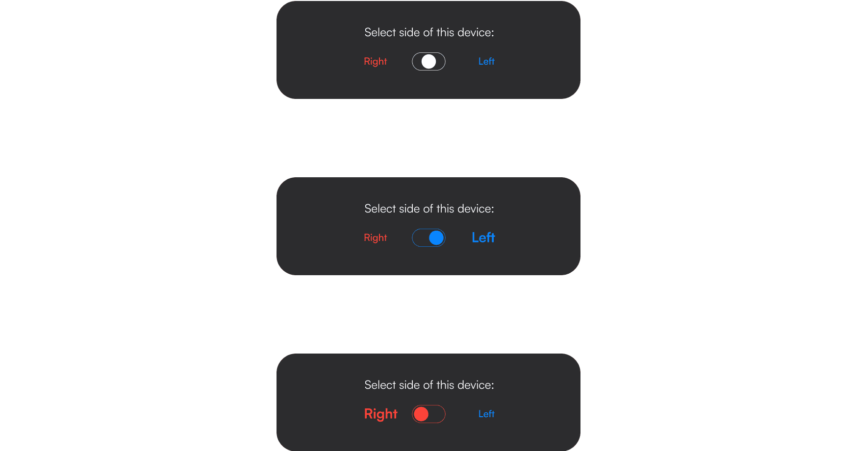
The side-selection overlay demonstrated how the interface could introduce a focused decision moment without visually breaking the product. The dual-device layouts showed how the system could scale into two-device control while still preserving identity, separation, & visibility.
The final UI was designed to feel calm, modern, & minimal, but its main role was functional.
It turned the controller into a clearer medical-device interface, where information, commands, & workflow states could be recognized more quickly & with less ambiguity.